Google Chrome Icon Revised by Fans Around the World
Posted in Browsers, Video | 6 Comments »


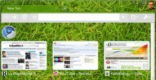
It’s time to stop Googling for hacks and tweaks to skin your beloved Google Chrome. Its also time to stop Googling for poorly-done themes that break your Chrome browser, Google Chrome Theme Gallery is an official Google project for Google Chrome -- themes are available for Google Chrome 3.0 and for Chromium Browser, the open-source project behind Google Chrome.

In both cases, that is, Google Chrome and Chromium browser just click on “Apply theme” to download-install a new theme. The “Grass theme” used in the screenshots are the most appreciated.
[Google Chrome Theme Gallery ]
Posted in Browsers, Open-Source, Ubuntu, Windows | 3 Comments »

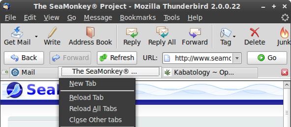
Linux/Windows: Whilst Mozilla is working hard to bring tabbed emails on an improved Thunderbird 3, amongst many other new features — tabbed emails are already present in pre-releases of Thunderbird 3, ThunderBrowse will add a new feature to Thunderbird 2 youdidn’t miss, until now, when you read this. More»
Posted in Browsers, Open-Source, Ubuntu, Windows | 2 Comments »

The good news is that you can now pick-up your Chrome for Linux, point it to video websites like YouTube, Hulu, YouPorn, Google Videos, Daily Motion, Metacafe and watch video. I’m not talking of Crossover Chromium. More»
Posted in Browsers, Open-Source, Ubuntu | 3 Comments »

We would like to modernize the shape of the tail.
Currently the Firefox appears as a two dimensional sprite placed in front of a three dimensional globe. We really like how in Jon Hick’s conceptual sketch the tail starts to wrap beyond the horizon of the globe. This gives the icon a strong three dimensional feel, and really streamlines and modernizes the overall design.
We would like to update the texture used for the Firefox and the globe.
Currently the globe is a gloss reflective surface and the Firefox is a matte surface, but this difference in textures could be made more pronounced. The softer we make the fox and the glossier the planet, the more the two can play off and contrast each other. This focus on texture will also give the icon a much higher fclasselity without introducing too much additional complexity in terms of the shape (like adding additional shapes in the fur).
It all began here. The inspiration of the Firefox icon partially came from here. More»
Posted in Browsers, Firefox, Open-Source | 2 Comments »