Firefox Icon History and Creative Brief – The Big Picture
We would like to modernize the shape of the tail.
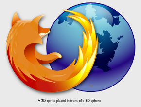
Currently the Firefox appears as a two dimensional sprite placed in front of a three dimensional globe. We really like how in Jon Hick’s conceptual sketch the tail starts to wrap beyond the horizon of the globe. This gives the icon a strong three dimensional feel, and really streamlines and modernizes the overall design.
We would like to update the texture used for the Firefox and the globe.
Currently the globe is a gloss reflective surface and the Firefox is a matte surface, but this difference in textures could be made more pronounced. The softer we make the fox and the glossier the planet, the more the two can play off and contrast each other. This focus on texture will also give the icon a much higher fclasselity without introducing too much additional complexity in terms of the shape (like adding additional shapes in the fur).
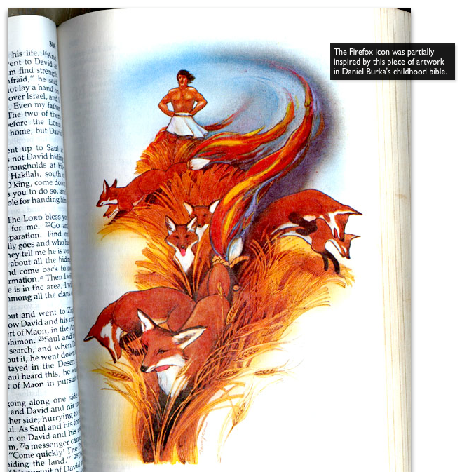
It all began here. The inspiration of the Firefox icon partially came from here.

All excerpts and images are taken from here: Firefox Icon History and Creative Brief for Shiretoko Refresh


7:42 pm on July 9th, 2009
Firefox Icon History and Creative Brief – The Big Picture http://bit.ly/4sxML9
1:00 am on August 22nd, 2009
[…] but with posters from the glorious past; Firefox mascots, web sites art, community store designs, Firefox icon etc. Users who join MCC the first week will get a “Founder” badge and those that join […]